Independent film magazines generally focus more on independent films or art-house styled films and are aimed towards a maturer audience with a different demographics. Magazines such as Sight & Sound and Little White Lies are examples of these types of magazines.
These magazines will have their biggest feature of each issue as their main covers. Sight & Sound, a BFI magazine, has a simple layour which has changed in recent years. The image below is of the new design of front cover, which generally keeps the main focus on the person at the center of the page and uses contrasting colours to make the text read-able.
These magazines have difference conventions to the bigger magazines. Their layouts have smaller text to include more information for the reviews. An example of a 4 pages spread of a main feature in Little White Lies layout is below.
There is a clear difference with this magazine, in comparison to one such as Empire, which is that there is a lot more writing for this one film. There are multiple different text fonts and sizes for specific parts of the review. A large sized first letter displays the professional look of the magazine and it frames the rest of the text. The quote is large and a different font to signify it's importance. The layout and style of the final 'scores' for the film is always the same, bottom right of the review with three distinct sections. The size of the numbers make these the most prominent part of this section of the review. The use of numbers signifies the importance of quality in films, the fact that it's not the universal used 5 star system, highlights the focus on the film and the film only.
The images used in the Little White Lies reviews are all screen-caps of the films, rather than using promotional images or poster images, these images don't give the film away, but more show of the stylistic aspect tothe film, as shown in the Shame review, with one photo taking up the majority of two pages of a toned down shot and the other images very bright and golden but with the character having as solemn a look as the other two in the first image.
The language used in Little White Lie is clearly directed more towards a mature audience or those with intrests in indie/arthouse films. An extract from just after the start of the review reads like this. 'Shame is a film that attempts to penetrate the psyche of a thirtysomething nymphomaniac named Brandon (Michael Fassbender; a man whose every waking minute comprises a cyclone of shallow intercourse and crushing indignity. In its most explicit moments, McQueen's film is inescapably divisive, regardless of its overarching nuance. But Shame always seeks to ofer more than hot flesh and quick thrills.' The maturity of the sexual nature of the film is directed to an audience that isn't focused on explosions or action, rather the cinematography and how the subject of a 'nymphomaniac' was dealt with.
Muted colours and a simple black and white layout contribute to the professional style and layout of this magazine.
From a look at Little White Lies, we decided that as a group we would use this magazine for our film review. Although rather than having our film as the main feature, it is rather part of the 'reviews' section and is just a double page spread.
Tuesday, 31 December 2013
Friday, 27 December 2013
Post 37 - Mainstream Film Magazines
Having a review in a film magazine is a vital part of getting a film seen to the audience you are aiming for, Hollywood Blockbusters and big independent films will use magazines such as Empire to be seen, as this is the biggest film magazine in the world.
The demographic of Empire is shown below:
With the majority of readers being male; in the ABC1 social class' and aged 15-24, the content of the magazine may focus on their psychographic needs. Empire's main features are often big action, superhero and adventure blockbusters to pull in their larger based audience. If you look at the cover images of the Empire Magazines within recent years there is a pattern of action, adventure and superhero/fantasy films taking prevalence with no romance or even comedy films being the main focus towards audiences.

Another big film magazine is Total Film. This magazine occasionally holds specials and focuses in on a specific genre of film, this will be whenever a genre has had an event or has multiple large budget films being released in a few years. Such as the 'Comic-Book Movie Special' which was released after 'New York Comic Con' earlier this year.
The demographic for Total Film is slightly different to Empire, as shown below, and has a much more mature audience, with the average age of 32.
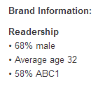
Because of the target audience for both Total Film and Empire, we as a group felt that the layout and what is included in reviews is suitable for out film, as we want to target an audience with a different psychographic to that of the above magazines.
The demographic of Empire is shown below:
With the majority of readers being male; in the ABC1 social class' and aged 15-24, the content of the magazine may focus on their psychographic needs. Empire's main features are often big action, superhero and adventure blockbusters to pull in their larger based audience. If you look at the cover images of the Empire Magazines within recent years there is a pattern of action, adventure and superhero/fantasy films taking prevalence with no romance or even comedy films being the main focus towards audiences.

Another big film magazine is Total Film. This magazine occasionally holds specials and focuses in on a specific genre of film, this will be whenever a genre has had an event or has multiple large budget films being released in a few years. Such as the 'Comic-Book Movie Special' which was released after 'New York Comic Con' earlier this year.
The demographic for Total Film is slightly different to Empire, as shown below, and has a much more mature audience, with the average age of 32.

Because of the target audience for both Total Film and Empire, we as a group felt that the layout and what is included in reviews is suitable for out film, as we want to target an audience with a different psychographic to that of the above magazines.
Post 36 - Final Poster Design
After collecting feedback from my second poster draft, I went onto the image manipulation program I used, G.I.M.P 2, and worked with tutorials to make my design better.
I had the idea of using text with a pattern rather than solid coloured text, from there I went onto Google Images and found that an image of a brain cell made a broken and sci-fi like pattern. This meant I could link the idea of memory loss within the plot of our film to the poster, so I did this with the title and the tagline. This also meant that these were heavily focused on but did not break the attention away from the rest of the poster.
I also took inspiration from the Filth poster with the Twitter [#hashtag] and Facebook link where the 'Coming soon' was placed. This meant that I met a convention of film posters.
 QR codes are common in mainstream media film posters, I looked at whether a QR would suit my poster. QR codes work as 'transitory media' and can be scanned on a mobline phone, linking to a website URL for the audience to then look into a product. These are becoming very common for large budget movies which would like to a trailer as part of a marketing ploy.
Using the website QRSTUFF and made a code to link to my blog. After testing this I found that it successfully linked back to my blog, so I have included the QR code in my final product. The size of it was a problem though because on the computer, the size on of the poster didn't work when scanning on the computer. However the actual code works.
I had the idea of using text with a pattern rather than solid coloured text, from there I went onto Google Images and found that an image of a brain cell made a broken and sci-fi like pattern. This meant I could link the idea of memory loss within the plot of our film to the poster, so I did this with the title and the tagline. This also meant that these were heavily focused on but did not break the attention away from the rest of the poster.
I also took inspiration from the Filth poster with the Twitter [#hashtag] and Facebook link where the 'Coming soon' was placed. This meant that I met a convention of film posters.
 QR codes are common in mainstream media film posters, I looked at whether a QR would suit my poster. QR codes work as 'transitory media' and can be scanned on a mobline phone, linking to a website URL for the audience to then look into a product. These are becoming very common for large budget movies which would like to a trailer as part of a marketing ploy.
Using the website QRSTUFF and made a code to link to my blog. After testing this I found that it successfully linked back to my blog, so I have included the QR code in my final product. The size of it was a problem though because on the computer, the size on of the poster didn't work when scanning on the computer. However the actual code works.
Post 35c - Second Draft Poster Design + Feedback
Feedback was collected on my two posters in the form of a questionnaire, below is the feedback I was given.
Post 35b - Poster Design - Vertical and Horizontal Poster
Feedback response from the final design:

 For this I looked at the vertical version of the 'Lincoln' poster, how they used the same image but condensed it to the shape and made Lincoln much larger than the text so that he is the main part of the poster. The white space and still emptiness of the poster is an aspect that I like, as it doesn't detract from the main focus of the poster, so show what the film is. That it's about the President of the USA and that again it's a serious film.
 I also looked at the vertical poster for 'Filth', which again has a lot of empty space, however this time it's blue rather than white, which conveys the darker element to the film and allows the image of the 'ladder of cocaine' to pack more of a punch and be clearer in showing that the film contains drug use with the main character, as they are shown taking in the substance.
- 'The tagline is the most obvious part to the poster, but I like how the title and 'Coming 2014' fits with the image.'
- 'I like the size and font of the title and how it has been done, however from far away it might not be easily read, though that could be used to entice people to look closer at it.'
- 'The bit at the top is too bright, I focus more on that than the rest of the poster.'
- 'You don't really see many posters which are this shape, I think a typical vertical poster would be better, although the image would have to be cut down a lot.'
After getting feedback on my final poster design (see above) I looked into horizontal and vertical poster layouts and looked at how these position the character, title and tagline to see how I could edit my final design.
Horizontal Film Posters

The 'The Adventures of Tintin' poster above shows how film posters with a horizontal layout are generally constructed, with a central image and text, going against how I laid out my own design. However, the imagery of the poster uses the plot of the film to fill the otherwise empty spaces each side of the central image; I think that as out film revolves around losing something [memories], the empty space, if used in a different way may convey this.

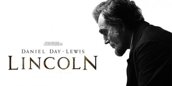
I then looked at the 'Lincoln' poster and immediately noticed the empty white space in the image. The poster uses the iconic figure of President Lincoln to sell the film, it clearly is a serious film, a drama; and doesn't give away any of the film's plot, thus the audience may be curious. The placement of the figure on the right and the text on the left fitting to the shape of the figure is something which I will take into consideration with the final poster I make.
Vertical Movie Posters
 For this I looked at the vertical version of the 'Lincoln' poster, how they used the same image but condensed it to the shape and made Lincoln much larger than the text so that he is the main part of the poster. The white space and still emptiness of the poster is an aspect that I like, as it doesn't detract from the main focus of the poster, so show what the film is. That it's about the President of the USA and that again it's a serious film.
 I also looked at the vertical poster for 'Filth', which again has a lot of empty space, however this time it's blue rather than white, which conveys the darker element to the film and allows the image of the 'ladder of cocaine' to pack more of a punch and be clearer in showing that the film contains drug use with the main character, as they are shown taking in the substance.
The simplicity of the poster is also something I focused on, how it doesn't actually have a 'title', rather it uses the Twitter hashtag - '#Filth' - to show the title.
The poster is all very linear too, which fits with the ladder imagery of 'climbing to the top', the text and image all line up with a dark background around it.
Sunday, 24 November 2013
Post 35 - Poster Designs
Following the conventions of a film poster, I looked at the conventions of the poster titles, taglines and image to begin the layout. Below is a few images of examples of layout I have an idea for.
I used the photo editing program 'G.I.M.P' to create a draft of a poster based on one of the layouts above. To do this, I used a screen-cap from one of our scenes which fit as the main image as it provided room for a title to fit to the side and frame the image itself. Whilst the tagline is not short like the general drama film poster is, I think that as a start the tagline incorporates what is in the film, showing that in involves memories/forgetting.
In this design, I wanted the tagline and the title to be clear and eye catching, so when editing I used the 'Drop Shadow' tool to create the effect of shadow behind the text. Also with the title I used a tool on the program called 'Blinds' to create the effect of the title bring broken up as earlier in my project, [Post 3], when looking at the characterisation of the antagonist, there was an image where someone had been split up into sections and I felt that this worked with the title of our film.
However, I have noticed that the tagline is what stands out the most and in the final poster design I will edit this.
Saturday, 23 November 2013
Post 33 - Drama Genre Posters [Specific to my Genre]
 Film posters can connect to the audience which genre of film they are watching, conventions of different genres have created conventions for the posters themselves.
 For example, I have looked at a drama film poster on the right, '127 Hours', and I notice that the layout is very empty, the main image is that of a canyon which frames the figure and boulder in the middle of the poster. The title and tagline are also framed by the image, the near symmetry of the canyon almost trapping the text inside.
The colours in this poster are something which I also noticed, the figure and the canyon are shrouded in shadow creating an atmosphere for the drama genre; whilst the sunset in the background alludes to the title. The text of the entire poster matches the sunset, the top being brighter than that bottom, except for the tagline 'Every Second Counts', which is white against a burgundy background, this contrast makes it very clear and whilst the text is small, it also is very clear and noticeable. The tagline itself is shot and straight to the point.
In comparison, I looked at the difference between the dramatic '127 Hours' poster and a 'Airplane' comedy poster.
 The poster for 'Airplane' automatically sells itself as a comedy film, the tagline acts as a joke, whilst '127 Hours' acts as a tense and curious enigmatic device for the film. The image consists of a cartoon aeroplane which is tied in a knot whilst flying seemingly normally, whilst '127 Hours'' image is very subtle and whilst reveals an idea of the time, it leaves the audience curious as to why the figure and a boulder are the main images.
Comedy film posters appear to have the convention of being bold and bright and 'in your face', to capture the audience's attention.
Drama film posters appear to use a single image with a contrast somewhere in the poster to catch the eye of the audience.
I looked into some other drama film posters to look at similarities within the genre and it's sub-genres. [L-R: Becoming Jane, The Show Must Go On, Black Swan]
First off, all three posters are character and image driven, all three consist of one large photo which takes up the majority of the poster, with Becoming Jane containing two. They also have the title towards the bottom of the poster, like '127 Hours' did too. I think that this is done as it creates a framing for the image and makes the image the key focus. Also only the middle on contains a tagline, which is to the side of the image, whilst the other two are versions of the poster which do not contain a tagline. Becoming Jane uses a divide between the two images to bring importance to the title, whilst the other two use contrast of white and black to make it clear and obvious.
Post 32a - Film Posters [Media Theory]
 Ronald Barthes' Media Theory
Ronald Barthes was a French theorist and semiologist and through his work of deciphering works were 'put together' there are 5 narrative codes within media which apply to posters.
- Action Code - Little actions which do not raise questions, used to build tension and suspense to an audience what is going to happen, and to entice them to guess.
- Enigma Code - An element which is not explained and acts as a mystery to get the audience involved and raise questions.
- Referential Code - Refers to an external [cultural, scientific or historical] body of knowledge.
- Symbolic Code - Looks at symbols and their connotations and the meanings behind them.
- Semantic Code - An aspect which suggests or refers to additional meaning.
He suggested that narratives are split into two, OPEN and CLOSED. OPEN is when a narrative can be unravelled in multiple different ways and they way it can be viewed can be different. CLOSED is when there is only one obvious way to interpret something.
Post 32 - Film Posters
The main reason film marketers produce posters is to promote the film, thus the poster it required to follow some conventions to fit this demand. A poster must be eye catching, posters can be displayed at cinemas, on billboards, on a bus stop, train station platforms etc, anywhere as they can be designed to fit any shape.
If a film poster was not eye catching in these locations then it would fail. A poster should be designed to be easily noticed and something people will look at as they go past it [or it goes past them], and thus there are features in a poster which capture the eye of an audience, this is usually one of the below.
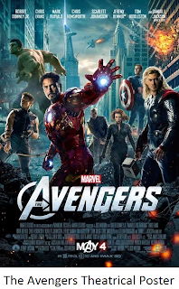 Character Posters - Multiple versions of a poster which contain one or two characters in the film, often is done to promote the actor.
If a film poster was not eye catching in these locations then it would fail. A poster should be designed to be easily noticed and something people will look at as they go past it [or it goes past them], and thus there are features in a poster which capture the eye of an audience, this is usually one of the below.
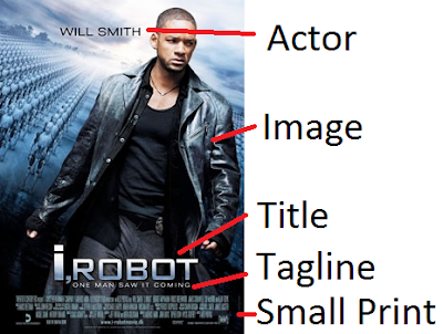
- A large centrally positioned photo of the main character/s
- Large bold font with the title/log-line.
TYPES OF FILM POSTERS
 Character Posters - Multiple versions of a poster which contain one or two characters in the film, often is done to promote the actor.
Teaser Poster - Usually will contain a main character and a release date, doesn't really contain much that reveals aspects of the film and rather is used to entice the audience to look it up.
Theatrical Poster - Is released with the film, this will usually contain all the main characters [either a group or the single main one] but will also include information on the production companies, actors, director, and title. Along with the release date and rating. Can also include reviews.
DVD Poster - Released alongside with the DVD release, will be the same poster as the theatrical but will include more reviews.
Main Features of a Poster

Post 31 - PRE-PRODUCTION: Crew List
Below is a list of jobs and the group members who preformed each job:
- Director - Myself
- Camera - Sabene and myself [at times]
- Lighting - Hannah [And Charlie when required]
- Production - Myself, Hannah and Sabene
- Editing - Myself
- Art Department - Myself
- Costume/Make-up - Sabene, Charlie, Hannah and myself.
- General Organiser - Myself [And Sabene when required]
- Pre-production - Sabene, Myself, Hannah and Charlie
When decided who would do what, each of us discussed what our strengths and weaknesses were and we split the jobs up between us to match them to our strengths.
Post 30 - PRE-PRODUCTION: Shooting Schedule
When doing our shooting schedule, I worked with my group to order the shots with lighting in mind. As we are filming in the winter, we have to make sure we film the early morning shots which require a lot of light, towards the start of filming so that we have enough light. We also worked through the shot list to make the schedule, keeping in mind when our group was available to film and the timing of our filming dates.
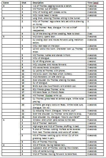
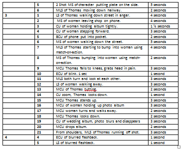


Post 29 - PRE-PRODUCTION: Shot List
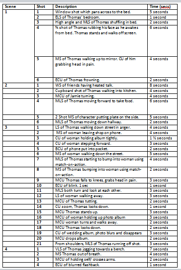
Below is the shot list one of our group compiled using the storyboard made earlier. It includes simply details for our shots and is ordered in a way to make it clear to both our cast and crew. The last column with the timing of each shot is very important for us to try and follow.


Friday, 22 November 2013
Post 28 - PRE-PRODUCTION: Risk Assessment
RISK ASSESSMENT
 When in members of our group's houses, we had to make sure that any wires from the microphone or personal objects were tucked away to avoid any damage to equipment or members of my group.
In the penultimate scene we shot in my own house and because of re-shooting, we had to move around furniture to accommodate the continuity of out film but also to make sure our actors were no harmed. As we filmed before and during the Christmas period, we would have to make sure that when there was a Christmas up, the mechanics of our film worked as followed: Moving the tree away from shot and actors to allow free movement and keeping equipment from the tree to avoid any tangling of wires, the tripod etc.

The outside shots the second scene would pose difficulty, the pathway we are using will be used by the public and we must make sure that the placement of our equipment does not post any threat of harm to the public. We also have to make sure all equipment is in sight at all times and with us to avoid any breaking or stealing of it.
We had to be aware of the fact that the ground was somewhat muddy and using the tripod on the grass for some shots was going to require us to be very careful with the equipment.
Post 27 - PRE-PRODUCTION: Location Reece and Risk Assessment
LOCATION REECE
LOCATION 1 - BEDROOM: For our opening scene we used one of our group's bedrooms as our main character is a student, this worked. We were careful in the room to move our personal stuff and the equipment into a safe area which was away from where we filmed, we opened up the tripod near this however, as shown in the picture.
LOCATION 2 - VILLAGE PATHWAY:After changing our location for Scene 3, during out filming we took these shots. Our location involved a tattoo shop, in which we used the walkway corner to have our female character [Woman] to exit out of. This was done so that we wouldn't need to inconvenience anyone in a shop with multiple takes.
We also used this location because of how open it was for us to position the characters and tripod/camera. This allowed us, whilst there were people using the pathway, to be out of people's way and get out shots done as efficiently as possible. It also limited the risk of damaging the equipment with too many people around us.
LOCATION 3 - KITCHEN: We also filmed inside my house for Scenes 2 and 5, this meant that we had to be careful of both the other members of the household, but also, in such a small space, to make sure the equipment was safe and packed away and any leads were not caught under furniture. In this location we have both natural and artificial lighting as we would be filming after school. This may mean we have to colour correct scenes.
LOCATION 4 - LIVING ROOM: We will only have artifical light within a cramped space and will have to colour correct the scenes. The space in this room will prove difficult because of the size of our shots and the camped space we are shooting in. Some shots will need the reflector in use to make sure our actor's faces are lit up and visable.
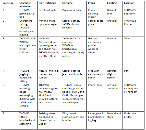
Post 26 - PRE-PRODUCTION: Mise-En-Scene Table
Below is the Mise-en-scene table one member of my group produced for our film, it provides the key aspects of each scene which all the cast and crew need to be aware of before filming. We used the template our group used in our AS media but have put more concise detail into it, so it's straight to the point and clear. The importance of this is so no member of the group is confused when looking up what costume they need or what props they need.
Friday, 15 November 2013
Post 25 - PRE-PRODUCTION: Storyboard
Below are the links to our storyboard, in two PDF files.
https://drive.google.com/file/d/0B8zVTMkwU8ADZnduWnpRdHdNblU/edit?usp=sharing
https://drive.google.com/file/d/0B8zVTMkwU8ADU2ZhM3g4NWpZNTQ/edit?usp=sharing
https://drive.google.com/file/d/0B8zVTMkwU8ADZnduWnpRdHdNblU/edit?usp=sharing
https://drive.google.com/file/d/0B8zVTMkwU8ADU2ZhM3g4NWpZNTQ/edit?usp=sharing
Thursday, 14 November 2013
Post 24 - PRE-PRODUCTION: Script
Two pages of our script.
Thursday, 7 November 2013
Post 23D - Researching our equipment - Camera Tests 2
Birds Eye
Canted Angle
Wednesday, 6 November 2013
Post 23C - Researching our equipment: Camera Tests
Focus
Mirror Shot
Tuesday, 5 November 2013
Post 23B - Researching our equipment - Sound Tests
We preformed two sound tests in our group, one in a classroom using a boom-mic and one in a corridor of our school using a phone to make a sound. We did this because some of our scenes are located in areas where we'll have sound echoes and needed to be aware of how this effects the sound of our actors.
Boom Mic
Corridor
Monday, 4 November 2013
Post 23A - Researching our equipment - Editing Software
In our group, we took the opportunity to play with Adobe After Effects and tutorials from Lynda.com in order to widen out experience with the program and look at things we could do.
This included how we would select a certain area of the shot; how to layer and more special effect related features.
This included how we would select a certain area of the shot; how to layer and more special effect related features.
Sunday, 3 November 2013
Post 22 - Film Distibution
As short films don't have the budget for high-end marketing, film-makers must find other ways in which to promote and show their film. This can be done through multiple platforms, be it social media/digital distribution or film festivals.
Some of the below information is from this booklet we were given by our teacher.
 Websites such as Twitter, Facebook and Tumblr are a great way to spread a film to an audience, word-of-mouth is vital for any film, but especially for short films with a small marketing budget or even none at all. Viral spread is what some film-makers desire and through video websites such as YouTube, short films can be uploaded and views by hundred and thousands of people. This digital distribution is also a away in which short films often find distributors if the film is sent to theatres and cinemas.
Phone apps such as 'Popcorn Horror' also supply app uses with short films to watch, this spreads an audience further than just the internet, it allows the fragmented audience access to these films offline.
Festivals are a great way to get independent films out to the audience, festivals are also often where both small and larger budget indie films gain distribution for theatrical release, such as Steve McQueen's film 'Shame' which, after the Toronto Film Festival was picked up by 'Fox Searchlight'.
Festivals are a great way for films to win awards, get recognition and find marketing ways to draw in an audience.
The BFI have one of the bigger UK based film festivals every year, which provides a platform for both bigger budget independent films and lower budget films to be submitted into may categories for people to then go and see.
However, most festivals will not allow content that is older than two years to be submitted and thus after these festivals, some films are left to find another way to thrive and reach their audience.
Some of the below information is from this booklet we were given by our teacher.
Social Media
 Websites such as Twitter, Facebook and Tumblr are a great way to spread a film to an audience, word-of-mouth is vital for any film, but especially for short films with a small marketing budget or even none at all. Viral spread is what some film-makers desire and through video websites such as YouTube, short films can be uploaded and views by hundred and thousands of people. This digital distribution is also a away in which short films often find distributors if the film is sent to theatres and cinemas.
Phone apps such as 'Popcorn Horror' also supply app uses with short films to watch, this spreads an audience further than just the internet, it allows the fragmented audience access to these films offline.
Film Festivals
Festivals are a great way for films to win awards, get recognition and find marketing ways to draw in an audience.
The BFI have one of the bigger UK based film festivals every year, which provides a platform for both bigger budget independent films and lower budget films to be submitted into may categories for people to then go and see.
However, most festivals will not allow content that is older than two years to be submitted and thus after these festivals, some films are left to find another way to thrive and reach their audience.
Saturday, 2 November 2013
Post 21 - Film Funding
Short films in general are forgiving in their nature to miss out on character development, be rather simplistic or have short production time, however there is less freedom to expand a universe or flesh out ideas. In relation to film funding, including too much in a film idea, leaving it confusing and sub-par, lowers the chance of a film-maker having their film funded.
 Finding someone to fund your script or finding the money to fund it yourself is a difficult task, film-makers in more recent years can rely on social media outlets and websites such as 'Kickstarter' which is a global project contributing website that helps projects raise the funds they need. Also using social platforms such as Facebook, Twitter, YouTube, film-makers can get their ideas seen to a greater audience than ever before.
 Within the UK, the BFI work with the National Lottery provide ways for film-makers to gain funding. This development was done so that the BFI could support film-makers across the UK, through 'film production, distribution, education, audience development and market research'.
 Finding someone to fund your script or finding the money to fund it yourself is a difficult task, film-makers in more recent years can rely on social media outlets and websites such as 'Kickstarter' which is a global project contributing website that helps projects raise the funds they need. Also using social platforms such as Facebook, Twitter, YouTube, film-makers can get their ideas seen to a greater audience than ever before.
 Within the UK, the BFI work with the National Lottery provide ways for film-makers to gain funding. This development was done so that the BFI could support film-makers across the UK, through 'film production, distribution, education, audience development and market research'.
Monday, 28 October 2013
Post 20 - Media Language - Mise-en-scene
Mise-en scene, the constructs of a scene, is one of the most vital aspects of a film to get right. This feature of film-making is all of what the audience sees, the locations, the props, the costumes, all of these are vital to the audience's understanding of what is going on in a film.
The short film above is based off of the video games 'Portal 2' and 'Half-Life'. Because of this, the mise-en-scene of the film was designed to be accurate to the design and image of both of the games, the example of the costumes is one of the most obvious, below are comparisons with the two characters and the live action film versions.
Lighting is also significant as the left image shows the character is either during sunrise or sun-set, due to the colour of the light, a slight orange; whilst the image on the right shows the character in bright daylight, the light to the side of him, this creates shadows which make him look powerful and threatening.
Sunday, 27 October 2013
Post 19 - Media Language - Sound
Within sound I have looked at three main features: Diegetic sound, non-diegetic sound and dialogue.
Diegetic sound is important in terms of keeping the film within reality, if there were to be a lot of sound effects or music then the core of the film would be lost, dialogue would be lost. So as a group we must be sure that out recordings of our film have clear cut dialogue and when editing, than any emotion within the dialogue is not lost. Also when we do any scene, we will have to make sure any noises of movement, doors opening and closing, running of a character, much be clearly recorded, diegetic sound constructs the atmosphere of a film, and we must make sure we keep an atmosphere.
In regards to non-diegetic sound, I have taken an opportunity to look into music within films and have found pieces of music we could use in our own film. I went onto the website 'AudioNetwork', which provides copyright free music and sound effects, and collected a few pieces of music. seen below.
City Lights is one of the pieces I've like to use during the town scene of our film, when our main character is running around, the beat of the film provides tension and dramatises the quite simplistic scene.
Cardiac Arrest is one which I would like to use as a sound effect, the thumping sound of a beating heart is present at the start and could be used to signify fear in our character.
In regards to dialogue, I've looked at the below film to study into how not a lot of dialogue is as effective as lots of dialogue.
In 'blind', the opening contains vital and clear dialogue which tells us where the film is set, the language of Japanese is apparent and the TV warning of radiation hint at a different world to our own. Along with the male character is acting protective of his pregnant wife. However as the film continues and we hear more muffled dialogue because of the gas masks the characters are seen to be wearing, this muffled dialogue places the audience into an uncomfortable position, and brings the atmosphere of a different world even more into play.
The film focuses more on diegetic sound, little hints of humanity, along with non-diegetic music, rather than using a lot of dialogue. This, to me, portrays the male protagonist's fear and emotions to his daughter in the scene where they are along in a white room.
Diegetic sound is important in terms of keeping the film within reality, if there were to be a lot of sound effects or music then the core of the film would be lost, dialogue would be lost. So as a group we must be sure that out recordings of our film have clear cut dialogue and when editing, than any emotion within the dialogue is not lost. Also when we do any scene, we will have to make sure any noises of movement, doors opening and closing, running of a character, much be clearly recorded, diegetic sound constructs the atmosphere of a film, and we must make sure we keep an atmosphere.
In regards to non-diegetic sound, I have taken an opportunity to look into music within films and have found pieces of music we could use in our own film. I went onto the website 'AudioNetwork', which provides copyright free music and sound effects, and collected a few pieces of music. seen below.
City Lights is one of the pieces I've like to use during the town scene of our film, when our main character is running around, the beat of the film provides tension and dramatises the quite simplistic scene.
Cardiac Arrest is one which I would like to use as a sound effect, the thumping sound of a beating heart is present at the start and could be used to signify fear in our character.
In regards to dialogue, I've looked at the below film to study into how not a lot of dialogue is as effective as lots of dialogue.
The film focuses more on diegetic sound, little hints of humanity, along with non-diegetic music, rather than using a lot of dialogue. This, to me, portrays the male protagonist's fear and emotions to his daughter in the scene where they are along in a white room.
Subscribe to:
Comments (Atom)


.png)


