- 'The tagline is the most obvious part to the poster, but I like how the title and 'Coming 2014' fits with the image.'
- 'I like the size and font of the title and how it has been done, however from far away it might not be easily read, though that could be used to entice people to look closer at it.'
- 'The bit at the top is too bright, I focus more on that than the rest of the poster.'
- 'You don't really see many posters which are this shape, I think a typical vertical poster would be better, although the image would have to be cut down a lot.'
After getting feedback on my final poster design (see above) I looked into horizontal and vertical poster layouts and looked at how these position the character, title and tagline to see how I could edit my final design.
Horizontal Film Posters

The 'The Adventures of Tintin' poster above shows how film posters with a horizontal layout are generally constructed, with a central image and text, going against how I laid out my own design. However, the imagery of the poster uses the plot of the film to fill the otherwise empty spaces each side of the central image; I think that as out film revolves around losing something [memories], the empty space, if used in a different way may convey this.
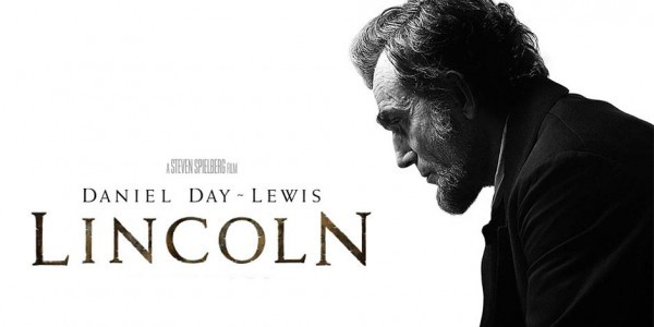
I then looked at the 'Lincoln' poster and immediately noticed the empty white space in the image. The poster uses the iconic figure of President Lincoln to sell the film, it clearly is a serious film, a drama; and doesn't give away any of the film's plot, thus the audience may be curious. The placement of the figure on the right and the text on the left fitting to the shape of the figure is something which I will take into consideration with the final poster I make.
Vertical Movie Posters
 For this I looked at the vertical version of the 'Lincoln' poster, how they used the same image but condensed it to the shape and made Lincoln much larger than the text so that he is the main part of the poster. The white space and still emptiness of the poster is an aspect that I like, as it doesn't detract from the main focus of the poster, so show what the film is. That it's about the President of the USA and that again it's a serious film.
 I also looked at the vertical poster for 'Filth', which again has a lot of empty space, however this time it's blue rather than white, which conveys the darker element to the film and allows the image of the 'ladder of cocaine' to pack more of a punch and be clearer in showing that the film contains drug use with the main character, as they are shown taking in the substance.
The simplicity of the poster is also something I focused on, how it doesn't actually have a 'title', rather it uses the Twitter hashtag - '#Filth' - to show the title.
The poster is all very linear too, which fits with the ladder imagery of 'climbing to the top', the text and image all line up with a dark background around it.
No comments:
Post a Comment