Tuesday 31 December 2013

Post 37b - Independent Film Magazines

Independent film magazines generally focus more on independent films or art-house styled films and are aimed towards a maturer audience with a different demographics. Magazines such as Sight & Sound and Little White Lies are examples of these types of magazines. 
These magazines will have their biggest feature of each issue as their main covers. Sight & Sound, a BFI magazine, has a simple layour which has changed in recent years. The image below is of the new design of front cover, which generally keeps the main focus on the person at the center of the page and uses contrasting colours to make the text read-able.
These magazines have difference conventions to the bigger magazines. Their layouts have smaller text to include more information for the reviews. An example of a 4 pages spread of a main feature in Little White Lies layout is below.

There is a clear difference with this magazine, in comparison to one such as Empire, which is that there is a lot more writing for this one film. There are multiple different text fonts and sizes for specific parts of the review. A large sized first letter displays the professional look of the magazine and it frames the rest of the text. The quote is large and a different font to signify it's importance. The layout and style of the final 'scores' for the film is always the same, bottom right of the review with three distinct sections. The size of the numbers make these the most prominent part of this section of the review. The use of numbers signifies the importance of quality in films, the fact that it's not the universal used 5 star system, highlights the focus on the film and the film only.


The images used in the Little White Lies reviews are all screen-caps of the films, rather than using promotional images or poster images, these images don't give the film away, but more show of the stylistic aspect tothe film, as shown in the Shame review, with one photo taking up the majority of two pages of a toned down shot and the other images very bright and golden but with the character having as solemn a look as the other two in the first image.

The language used in Little White Lie is clearly directed more towards a mature audience or those with intrests in indie/arthouse films. An extract from just after the start of the review reads like this. 'Shame is a film that attempts to penetrate the psyche of a thirtysomething nymphomaniac named Brandon (Michael Fassbender; a man whose every waking minute comprises a cyclone of shallow intercourse and crushing indignity. In its most explicit moments, McQueen's film is inescapably divisive, regardless of its overarching nuance. But Shame always seeks to ofer more than hot flesh and quick thrills.' The maturity of the sexual nature of the film is directed to an audience that isn't focused on explosions or action, rather the cinematography and how the subject of a 'nymphomaniac' was dealt with.

Muted colours and a simple black and white layout contribute to the professional style and layout of this magazine.

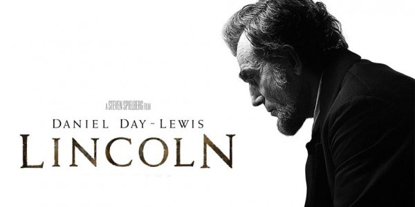
From a look at Little White Lies, we decided that as a group we would use this magazine for our film review. Although rather than having our film as the main feature, it is rather part of the 'reviews' section and is just a double page spread.

Friday 27 December 2013

Post 37 - Mainstream Film Magazines

Having a review in a film magazine is a vital part of getting a film seen to the audience you are aiming for, Hollywood Blockbusters and big independent films will use magazines such as Empire to be seen, as this is the biggest film magazine in the world. 

The demographic of Empire is shown below:

With the majority of readers being male; in the ABC1 social class' and aged 15-24, the content of the magazine may focus on their psychographic needs. Empire's main features are often big action, superhero and adventure blockbusters to pull in their larger based audience. If you look at the cover images of the Empire Magazines within recent years there is a pattern of action, adventure and superhero/fantasy films taking prevalence with no romance or even comedy films being the main focus towards audiences.


Another big film magazine is Total Film. This magazine occasionally holds specials and focuses in on a specific genre of film, this will be whenever a genre has had an event or has multiple large budget films being released in a few years. Such as the 'Comic-Book Movie Special' which was released after 'New York Comic Con' earlier this year.

The demographic for Total Film is slightly different to Empire, as shown below, and has a much more mature audience, with the average age of 32.


Because of the target audience for both Total Film and Empire, we as a group felt that the layout and what is included in reviews is suitable for out film, as we want to target an audience with a different psychographic to that of the above magazines.

Post 36 - Final Poster Design

After collecting feedback from my second poster draft, I went onto the image manipulation program I used, G.I.M.P 2, and worked with tutorials to make my design better.

I had the idea of using text with a pattern rather than solid coloured text, from there I went onto Google Images and found that an image of a brain cell made a broken and sci-fi like pattern. This meant I could link the idea of memory loss within the plot of our film to the poster, so I did this with the title and the tagline. This also meant that these were heavily focused on but did not break the attention away from the rest of the poster.


I also took inspiration from the Filth poster with the Twitter [#hashtag] and Facebook link where the 'Coming soon' was placed. This meant that I met a convention of film posters.


QR codes are common in mainstream media film posters, I looked at whether a QR would suit my poster. QR codes work as 'transitory media' and can be scanned on a mobline phone, linking to a website URL for the audience to then look into a product. These are becoming very common for large budget movies which would like to a trailer as part of a marketing ploy.

Using the website QRSTUFF and made a code to link to my blog. After testing this I found that it successfully linked back to my blog, so I have included the QR code in my final product. The size of it was a problem though because on the computer, the size on of the poster didn't work when scanning on the computer. However the actual code works.

Post 35c - Second Draft Poster Design + Feedback

From my research, I found that both vertical and horizontal posters were made for drama films. So I made two posters. One vertical and one horizontal.


Feedback was collected on my two posters in the form of a questionnaire, below is the feedback I was given.


Post 35b - Poster Design - Vertical and Horizontal Poster

Feedback response from the final design:

  • 'The tagline is the most obvious part to the poster, but I like how the title and 'Coming 2014' fits with the image.'
  • 'I like the size and font of the title and how it has been done, however from far away it might not be easily read, though that could be used to entice people to look closer at it.'
  • 'The bit at the top is too bright, I focus more on that than the rest of the poster.'
  • 'You don't really see many posters which are this shape, I think a typical vertical poster would be better, although the image would have to be cut down a lot.'
After getting feedback on my final poster design (see above) I looked into horizontal and vertical poster layouts and looked at how these position the character, title and tagline to see how I could edit my final design.

Horizontal Film Posters


The 'The Adventures of Tintin' poster above shows how film posters with a horizontal layout are generally constructed, with a central image and text, going against how I laid out my own design. However, the imagery of the poster uses the plot of the film to fill the otherwise empty spaces each side of the central image; I think that as out film revolves around losing something [memories], the empty space, if used in a different way may convey this.

I then looked at the 'Lincoln' poster and immediately noticed the empty white space in the image. The poster uses the iconic figure of President Lincoln to sell the film, it clearly is a serious film, a drama; and doesn't give away any of the film's plot, thus the audience may be curious. The placement of the figure on the right and the text on the left fitting to the shape of the figure is something which I will take into consideration with the final poster I make.

Vertical Movie Posters

Lincoln (2012) PosterFor this I looked at the vertical version of the 'Lincoln' poster, how they used the same image but condensed it to the shape and made Lincoln much larger than the text so that he is the main part of the poster. The white space and still emptiness of the poster is an aspect that I like, as it doesn't detract from the main focus of the poster, so show what the film is. That it's about the President of the USA and that again it's a serious film.

I also looked at the vertical poster for 'Filth', which again has a lot of empty space, however this time it's blue rather than white, which conveys the darker element to the film and allows the image of the 'ladder of cocaine' to pack more of a punch and be clearer in showing that the film contains drug use with the main character, as they are shown taking in the substance.
The simplicity of the poster is also something I focused on, how it doesn't actually have a 'title', rather it uses the Twitter hashtag - '#Filth' - to show the title. 
The poster is all very linear too, which fits with the ladder imagery of 'climbing to the top', the text and image all line up with a dark background around it.