I had the idea of using text with a pattern rather than solid coloured text, from there I went onto Google Images and found that an image of a brain cell made a broken and sci-fi like pattern. This meant I could link the idea of memory loss within the plot of our film to the poster, so I did this with the title and the tagline. This also meant that these were heavily focused on but did not break the attention away from the rest of the poster.
I also took inspiration from the Filth poster with the Twitter [#hashtag] and Facebook link where the 'Coming soon' was placed. This meant that I met a convention of film posters.
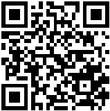
 QR codes are common in mainstream media film posters, I looked at whether a QR would suit my poster. QR codes work as 'transitory media' and can be scanned on a mobline phone, linking to a website URL for the audience to then look into a product. These are becoming very common for large budget movies which would like to a trailer as part of a marketing ploy.
Using the website QRSTUFF and made a code to link to my blog. After testing this I found that it successfully linked back to my blog, so I have included the QR code in my final product. The size of it was a problem though because on the computer, the size on of the poster didn't work when scanning on the computer. However the actual code works.


No comments:
Post a Comment