Thursday, 9 January 2014

Post 41 - Third Draft + Feedback

Below is the third draft of our film. This draft was much cleaner cut and the sound was edited to not jump like before. There were shots which we kept long to see how the audience reacted and from advice we then would edit the film to completion.


We then collected feedback from a member of our target audience who was not a media student but had been aware of the film, poster and the review.


What was taken from the feedback:

  • The film itself could have been longer and whilst our group was aware when editing that our film was a bit shorter than we had originally hoped for, this feedback member later suggested that the film could have had more scenes.
  • The music and sound effects choices were good, that they made the audience feel for the character, especially the end music.
  • The guessing of the genre was spot on, so we knew that we had done well to convey the form and conventions of the mystery and drama genre.
  • The target audience was suggested to be lower than what we had planned it to be. We agreed that those younger that our target audience may also be in the audience because of the sci-fi elements.
Wednesday, 8 January 2014

Post 40 - Second Film Draft + Feedback

Here is the second draft for our short film. On this draft music has been added and the cuts have been made much better.


The video below was the start of our feedback session. Here we have showed that they are watching our film and who is providing the feedback. We have a mix of both media and non media student and those of different ages.


After our audience watched the film, we had a question and answer session which is shown in the video below.


Tuesday, 7 January 2014

Post 39 - First Film Draft + Feedback

This is the first rough cut of our film, it does not contain out music selection except for the end and has very basic cuts. It also does contain a few sound effects.


Monday, 6 January 2014

Post 38b - Magazine Draft feedback

We collected feedback from our target audience for the magazine spread we, as a group, had created. The feedback received was given by those of the ages 16-20 years old, with some members of the group having watched drafts of the film and thus had a clearer take on the review. This feedback has been summarised below by one of my group members:


Pros
Cons
Room for improvement
Layout was neat with image and looks professional.

Font style too small
Small mistakes of punctuation errors and film title in inverted commas
Tone of voice fit that of a review; criticising
Slightly contradictory in places.
Maybe make the writing around the rating system could be clearer.
Directly addressing audience
Some points not clear and needed to be written differently to make more sense.

It gives provides what is good and bad


Not just actors were mentioned, the director was too.


Rating system and the comments were professional


Does not give away plot; entices you to watch film


From the feedback given, one of my group went ahead and make slight changes to the magazine spread in order to fit the needs of our target audience.

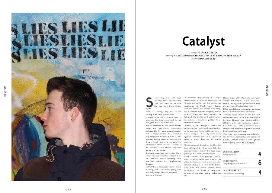
Post 38 - Film Magazine Two Page Spread Draft


In our final draft we used online tools to get fonts which were as close to the original fonts as possible. Using 'WhatTheFont!' I was able to source fonts from images of the original Little White Lies review page.


LINK TO THE MAGAZINE SPREAD

Wednesday, 1 January 2014

Post 37d - Conventions of Magazine Spreads

From my analysis of both mainstream and independent film magazines I have found conventions within both which will be transferred into my group's film review. These conventions are usually followed to entice the reader's attention and the prompt and boost hype of the film to make the audiences want to go see the film. The transferability of some of these conventions won't be easy due to the fact we chose an independent film magazine for our review spread, thus some conventions only within the mainstream features will not apply. I also used THESE TWO SlideShare to research the conventions.

  • Image: Is required to present the main character/s to the audience. In larger magazines this may include multiple characters or even a scene, whilst in smaller magazines this may be a medium long shot or medium close up of the main protagonist in a shot to represent the genre of the film. Also can be a teaser.
  • Font: Font size and colour will depend on the size of the magazine, but black and smaller font is general convention. However if the theme of the review is more related to a specific genre, e.g horror, then the font may change to represent the genre better; such as red font and a different style of font.
  • Quotes: These will either be from an actor or director which can sum up the film; give some of the plot to entice the audience; be an exert from the review itself etc.
  • Masthead - This is the banner/text, usually in the top left hand corner which tells the reader which magazine the review is in and acts as branding to identify to the audience and make a connection.
  • Release Date: Will usually be at the end of a review unless in a seperate part of the page before the review which has key details. 
  • Rating of the film: Can be in the form of a 5 Star system, or simply numbers for categories. It tells the reader whether or not the film is critically acclaimed. This will always be at the end of the review.


Post 37c - Annotated Film Magazines

Below is the annotation I made on a two page spread on 'The Hunger Games: Catching Fire' within Total Film magazine. Along with annotation of two pages of a 4 spread of 'Shame' within Little White Lies. I have made notes below both images to show the comparisons I noted from the annotation.


  • Total film appears a lot more 'cluttered' and busy, with the 'similar films to watch', 'talking point' and 'predicted interest curve' filling up space where there could be review. In comparison, Little White Lies simply has all review, no 'mainstream magazine' features, just review text and then the scores at the end. 
  • Little White Lies appears to look more sleek and professional.
  • The layout of text in both reviews is actually similar, both compliment the shape of the photograph, however Total Films review is more dotted around the place, whilst LWLs review is straight and without disturbance.
  • Both images to take away slightly from the review. The image of Shame does overpower the text due to the small font, whilst the Hunger Games pictures is placed in the middle of both pages and is what the audience see straight away.